There’s a specific moment where a tool moves from “impressive demo” to “I actually use this for client work.” For AI image generation, that moment has been slow to arrive. The previous generation produced things that looked good until you looked closely. Garbled text. Hands that defied anatomy. Characters that drifted across panels. ChatGPT Images 2.0 is the version that closes most of those gaps, and the range of what it can now produce in a single session is genuinely different from what came before.
OpenAI released Images 2.0 with a gallery that makes the point better than a spec sheet would. Manga pages with accurate Japanese dialogue. Thai street scenes with legible signage. A print-ready Art Deco bookmark with bleed marks and trim guides. A mathematically accurate infographic of Cantor’s diagonalization proof. A vintage comic strip with consistent characters across multiple panels. These are not edge cases. They’re the core demonstration of what changed.
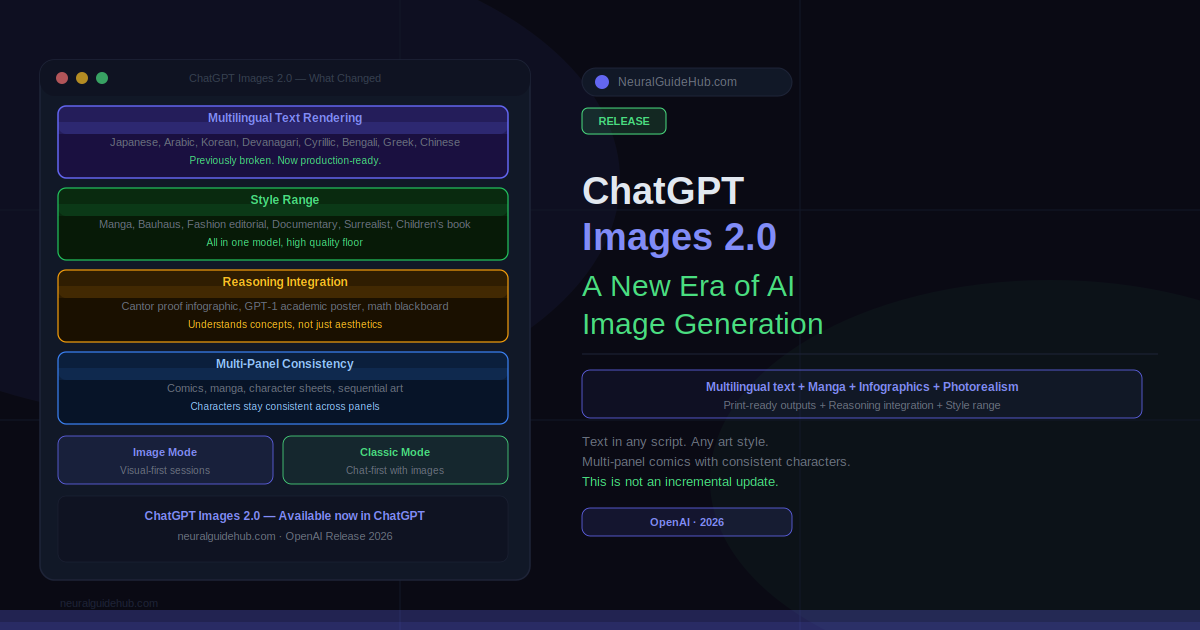
What Actually Improved in ChatGPT Images 2.0
Text rendering inside images was broken before. Not unreliable. Broken. Non-Latin scripts were essentially unusable. Images 2.0 changed this across Japanese, Arabic, Korean, Devanagari, Cyrillic, Bengali, Greek, Chinese, and Latin scripts. The “Stronger Across Languages” and “Typography” posters in the release gallery demonstrate this directly, with multilingual letterforms that are actually accurate rather than decorative approximations of scripts the model didn’t understand.
The practical implication is real. A Korean hospitality brochure with correct Hangul typography. A Japanese manga page with readable dialogue. A South Asian bookstore display with accurate script on each cover. Markets that were effectively excluded from AI image generation because the text output was useless can now use this tool for production-ready assets.
ChatGPT Images 2.0 Style Range
The stylistic range in this release is wider than anything previous versions handled. The gallery demonstrates photorealism, editorial poster design, Bauhaus, seinen manga, shonen manga, indie comic, vintage American comic, French New Wave, children’s book illustration, anime character sheets, fashion editorial, documentary street photography, and surrealist portraiture. In a single model.
What’s worth noting is the quality floor. Previous versions could approximate these styles but often in ways that felt like imitations. The candid nighttime flash photo of two friends on a city street looks like it was taken at a party in 2003, not generated. The cinematic coastal portrait with misty cliffs and a parked car has the kind of environmental storytelling that requires real compositional understanding. The seinen manga page follows the actual visual grammar of the genre rather than just looking manga-adjacent.
The aliens at a café image is worth mentioning specifically. Two photorealistic gray aliens seated at an outdoor table with coffee, blending into a busy city street with the casualness of regulars. It’s genuinely funny and genuinely photorealistic. That combination wasn’t available before.
Reasoning Integration: The Feature Most Reviews Will Miss
The most significant capability that doesn’t fit neatly into a style comparison is the reasoning integration. Images 2.0 can now function as a visual thought partner rather than a prompt executor. You describe a concept and the model designs a visual explanation of it, not a visual that looks related to it.
The Cantor diagonalization infographic in the release gallery makes this concrete. That’s a specific mathematical proof with a specific logical structure. The image produced is structurally accurate. The diagonal construction is shown correctly. The argument is visually legible. Generating that required the model to understand the proof well enough to represent it, not just recognize that it’s math-related.
The same applies to the GPT-1 paper reimagined as a conference-style infographic. Dense academic content translated into readable sections with data visualization. The classroom blackboard showing the sum of consecutive odd numbers forming perfect squares, with the actual proof laid out correctly. These outputs require reasoning about the content, not just aesthetic choices about how to represent it.
Image Mode vs Classic Mode
The release includes two interface modes. Image Mode puts visual output at the center of the session, optimized for iterations where every turn is about the image. Classic Mode keeps the chat-first experience with image generation as one output type among many. The distinction matters for workflow. If you’re building a brand identity or iterating on a character design, Image Mode keeps you focused. If you’re producing an infographic alongside the text it illustrates, Classic Mode maintains the context that makes the image accurate.
Multi-Panel Consistency
One of the longstanding problems with AI image generation for comics and sequential art was character drift. A character looked different in every panel because the model had no persistent representation of what they looked like. Images 2.0 handles multi-panel work with significantly better consistency.
The Miami museum vintage comic page holds character identity and visual style across a full narrative sequence. The Spud and Garlic comic page maintains its food-character designs through an entire travel story. The anime character reference sheet for “Adele” produces a coherent character with expressions, poses, and ability notes that all describe the same person. These are outputs that would have required significant post-processing to achieve in any previous AI image tool.
Print-Ready Outputs
The Art Deco bookmark design is the specific output that surprised me most in the release gallery. It includes bleed marks, trim guides, and safe margin lines. That’s production-ready file output from a text prompt. The Kizuna Matcha café launch poster has the layout quality of something a junior designer would produce after a full brief. The product mockup grid for OpenAI merchandise presents shirts, hoodies, caps, keychains, and mugs in a polished branded layout.
These aren’t aspirational examples of what the model might produce with careful prompting. They’re the default gallery outputs used to introduce the release. The production quality ceiling has moved significantly.
What ChatGPT Images 2.0 Still Gets Wrong
Worth being direct about this. Highly detailed hand close-ups still present challenges occasionally. The model’s ability to render specific real people’s likenesses is restricted by policy. Physics-accurate technical diagrams for specialized engineering or scientific work need human verification before use. Complex multi-character scenes with more than three or four distinct individuals still drift.
None of these are unique to Images 2.0. They’re the remaining hard edges of AI image generation generally. But they’re worth knowing before you set expectations for a production workflow.
ChatGPT Images 2.0 is available now in ChatGPT. Both Image Mode and Classic Mode are accessible from the interface. ChatGPT Plus users have the most reliable access. The release is rolling out broadly, with the full feature set available at chatgpt.com.